Create a warm, French-inspired visual identity for a new Park City bakery that captured the charm and character of a traditional neighborhood boulangerie. The identity needed to feel established and handcrafted from the start, with a nod to their popular French restaurant, The Easy Street Brasserie & Bar, while providing a cohesive visual system that could extend across the bakery's storefront, packaging, menus, signage, and promotional materials.
Whitney Advertising
Art Director
Create a warm, French-inspired visual identity for a new Park City bakery that captured the charm and character of a traditional neighborhood boulangerie. The identity needed to feel established and handcrafted from the start, with a nod to their popular French restaurant, The Easy Street Brasserie & Bar, while providing a cohesive visual system that could extend across the bakery's storefront, packaging, menus, signage, and promotional materials.
The owners of Sky Lodge on Main Street in Park City were preparing to open a new bakery within one of their properties and turned to Whitney Advertising to create its brand identity. As Art Director, I helped develop a visual language that captured the warmth and nostalgia of a neighborhood bakery while feeling at home in a contemporary Park City setting.
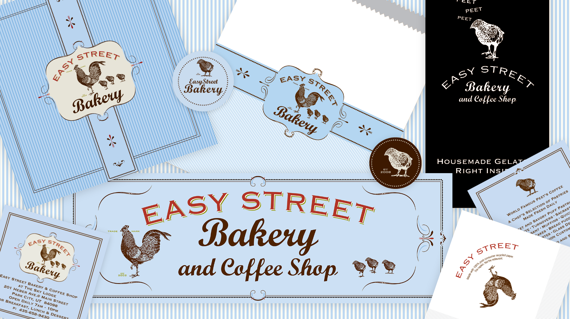
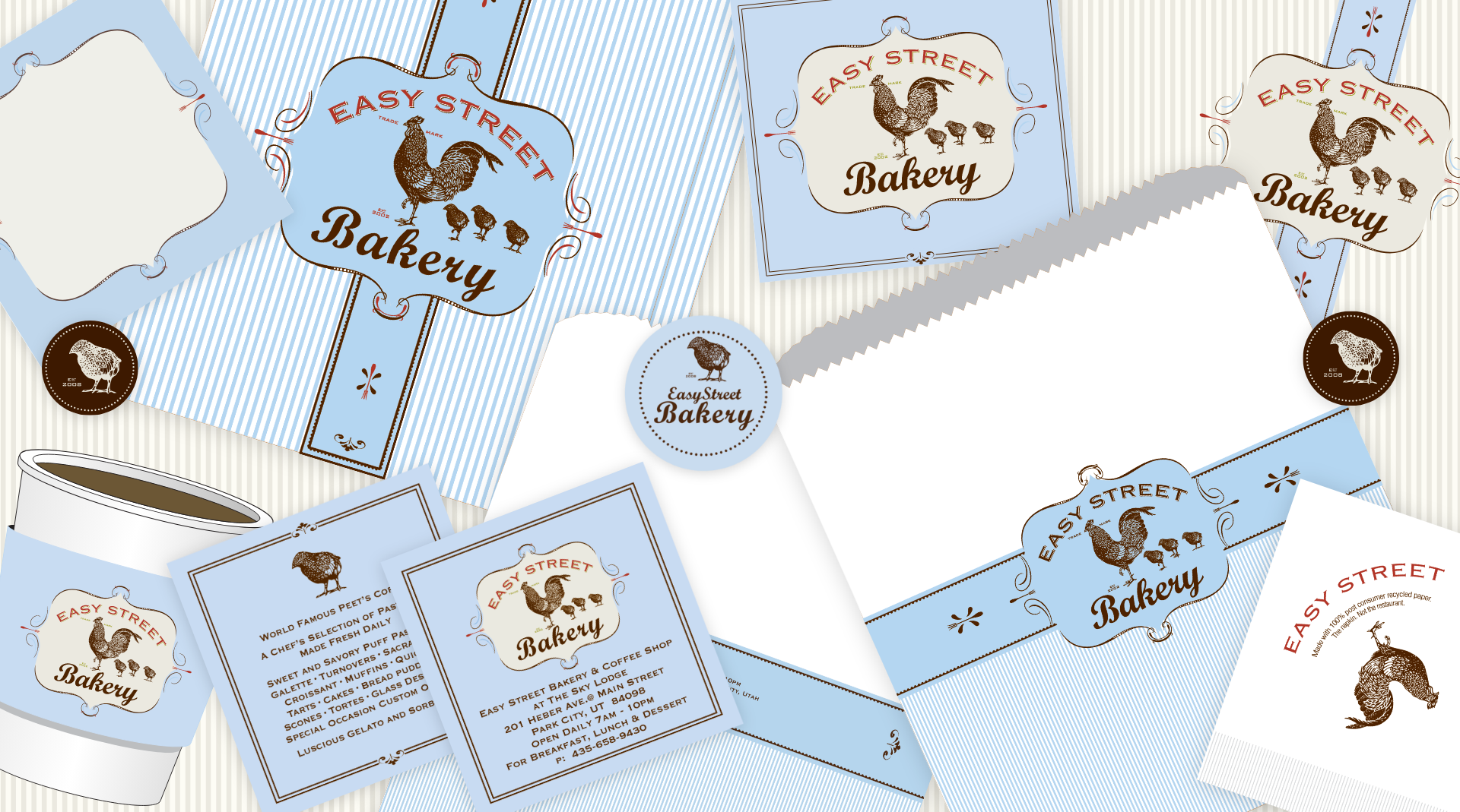
The identity combined vintage-inspired typography, hand-drawn illustration, decorative details, and a signature blue pinstripe pattern that became a recognizable brand element. We carried the system across storefront signage, menus, packaging, coffee cups, bags, labels, and promotional materials, creating a cohesive brand experience from the bakery itself to the smallest customer touchpoint.
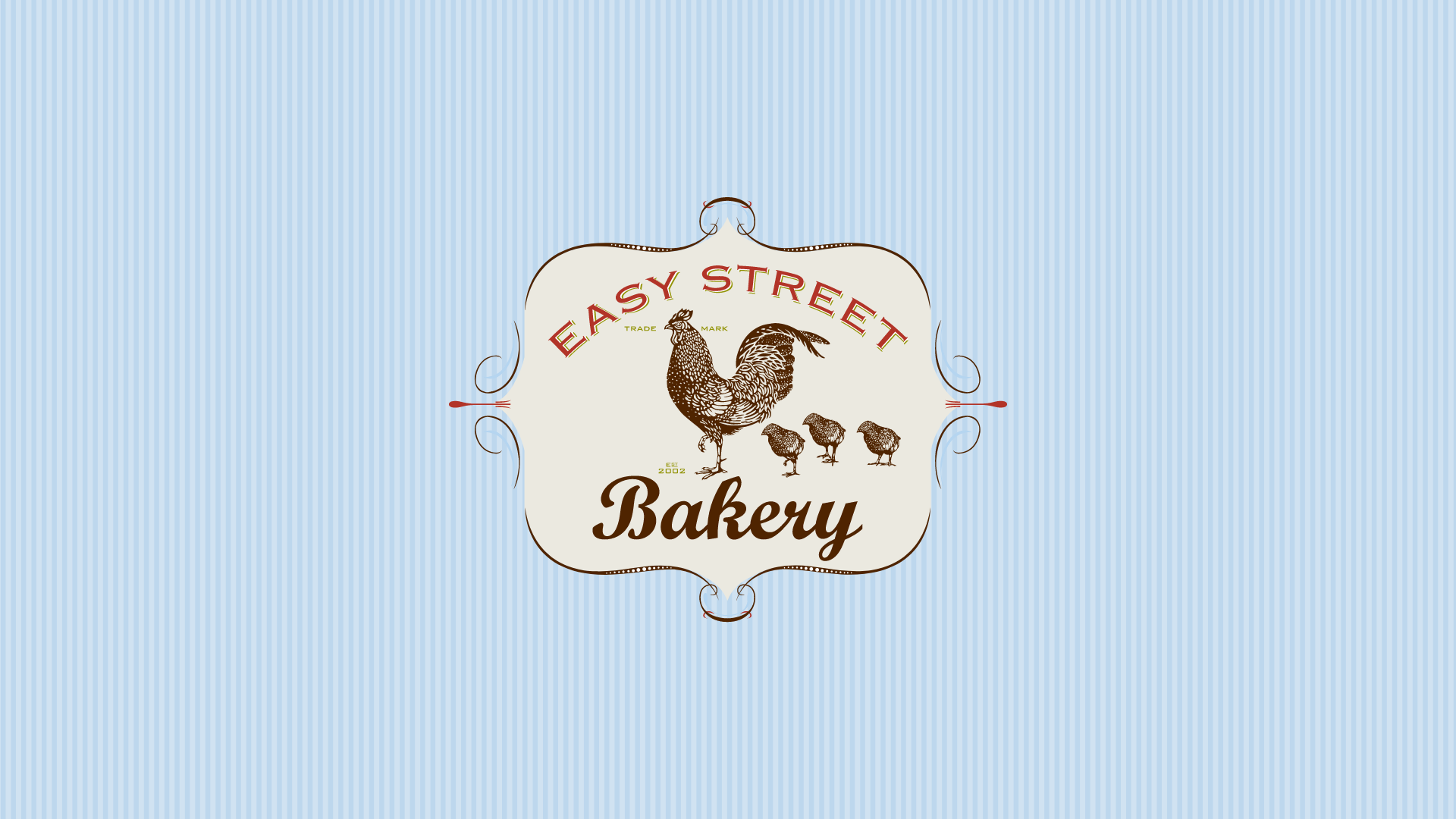
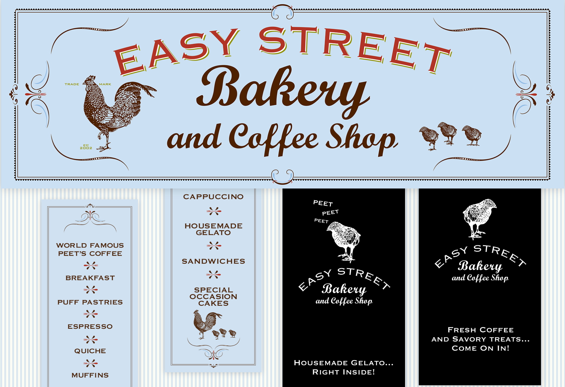
For the logo, I used the existing Easy Street Brasserie & Bar rooster illustration and typography and we commissioned an illustrator to create the 3 chicks for the bakery identity.

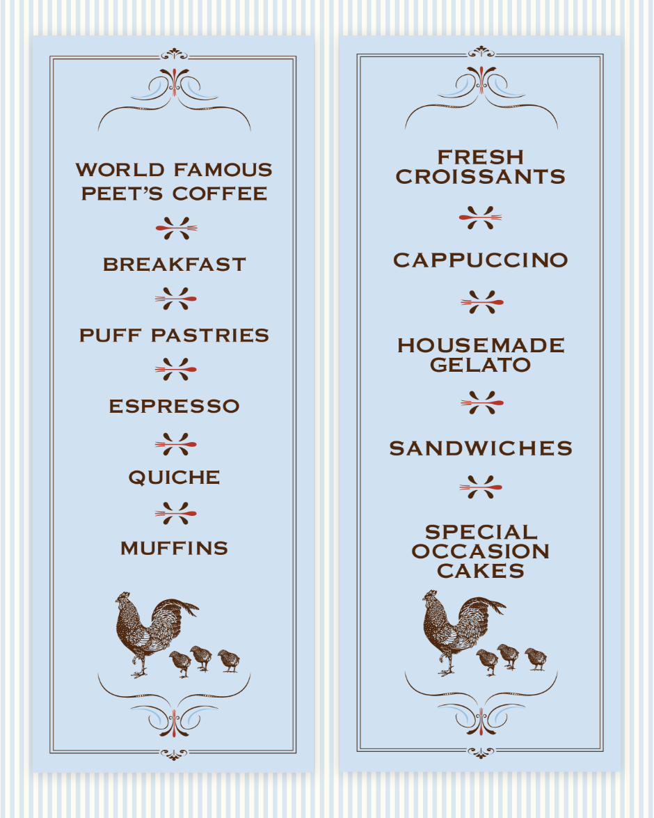
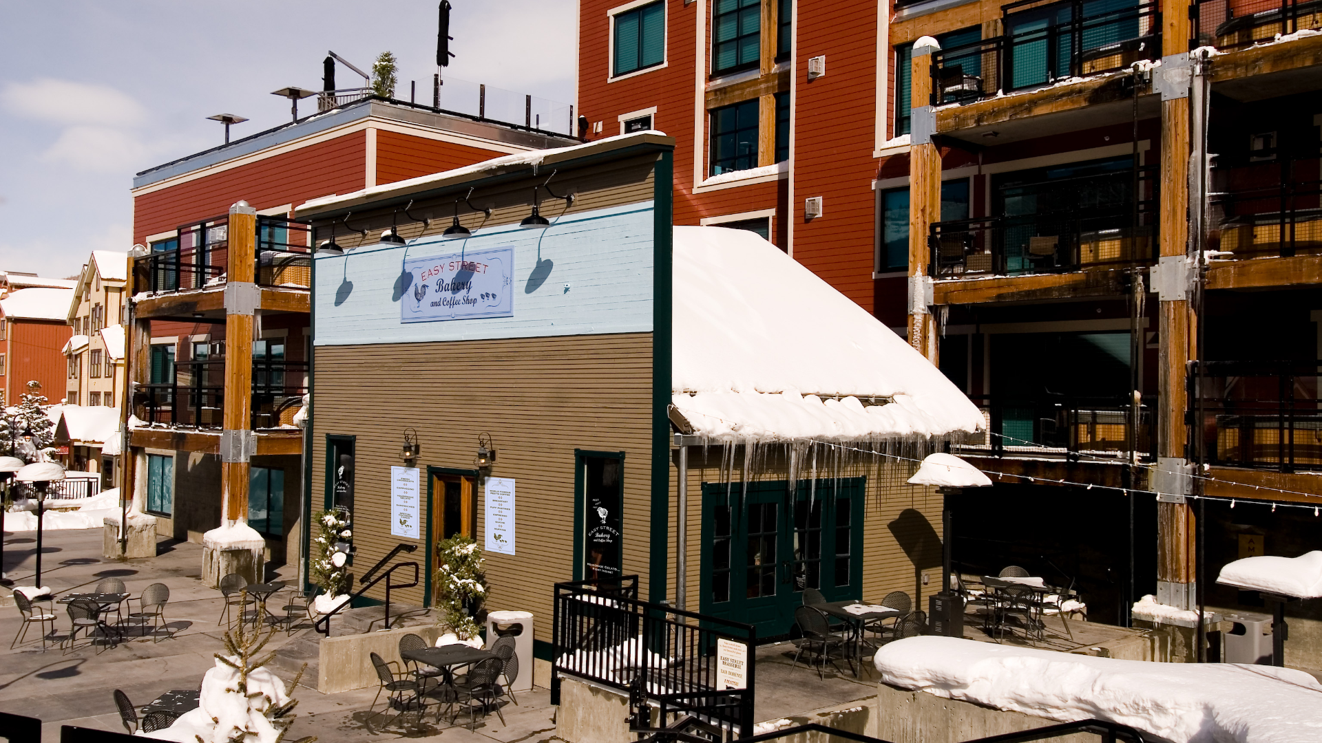
Included the main sign on the building as well as window vinyls and the 2 signs posted near the entry door displaying the French pastries and treats customers could purchase inside.
I introduced the blue stripe as a pattern I could use consistently throughout the print collateral and packaging. As well as using the script and the nostaglic copperplate typography.
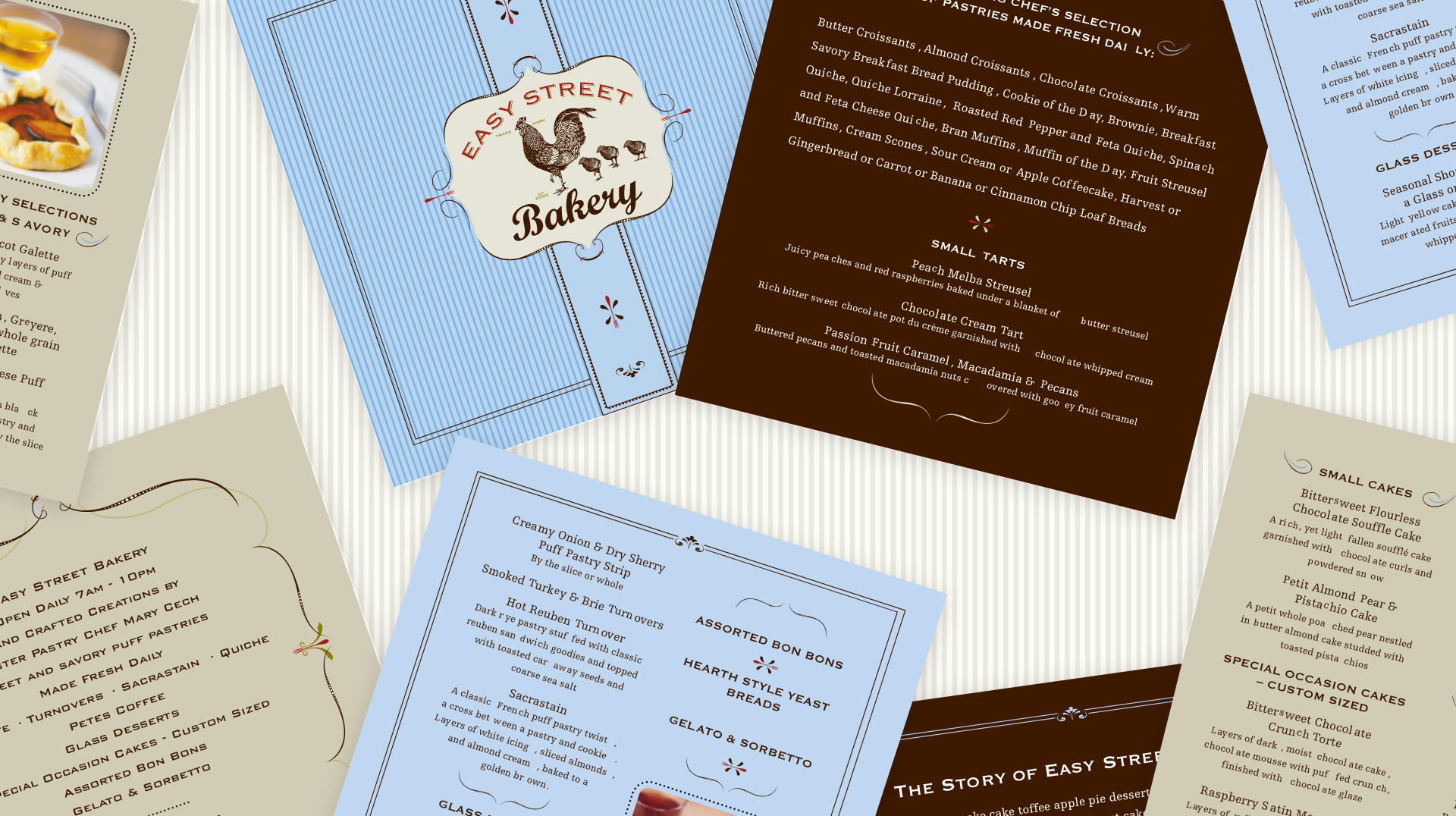
The resulting identity gave Easy Street Bakery a distinctive French-inspired personality and a cohesive visual language that could carry across the entire customer experience. From the storefront and signage to packaging, menus, coffee cups, and promotional materials. The consistent use of typography, illustration, ornamentation, and pattern created a memorable brand presence with a warm, handcrafted feel.